Tuesday, 5 May 2015

FMP - Photos and Timeline

In today's session, I printed of the final pieces of artifacts that will go in my fictional exhibition. The first lot of artifacts that I printed off was the faked photoshopped photos of the palace, the shrine to Amalurra, and the stone fragment with the depiction of Synd. I printed these pieces out on photographic paper and then roughed them up with a variety of techniques to age them a bit more. I used sandpaper to scratch around the edges and surfaces of the photos make it look like the photos have been through hell to get where they are, and I also scratched the fold lines to make it look they have been weathered time and time again. Then I used tea bags to stain it and smudge some of the ink to make it look like it has seen some damage and trials. 


The last artifact that I printed off today was an image of Sultana Faithiyya onto a piece of cloth to make it look like some original painting. I used transfer paper to get the image onto the fabric by printing the image out and then pressing it onto the fabric with a heat press that transferred the image onto the burlap. Then I frayed the edges a bit with my hands and scissors to get it look rough and worn. I think overall the look was a success as it reminds me of the illustrations and prints you would find in like a church or a similar place of worship for sale, but I wish the transfer was't so shiny as it gives the game away a bit and makes it look to fake-ish.  


FMP - Pamundur Timeline Finished

In today's session I successfully finished off my time line and have added a new logo for my fictional art and history company that will "display" this fictional country's exhibit. I have added the rest of my country's history onto the timeline and the additional two images of my Sultanas. Most of the history created for the Pamundur Empire is supposed to parallel to real-life events in history including events such as the Boston Massacre and the real-life backstory of the rise of the Ottoman Empire. Most of the Sultana's are also based upon legendary figures of history with two being based on real-life Sultans and Kings, e.g. Kali the Grim = Ivan the Terrible, Faithiyya the Valiant = Suleiman the Magnificent, etc... 


The logo that I created to be my "company" that presents this all in their exclusive exhibit is the "The People's Art and History Gallery", a independent museum exhibition company that specializes in artifacts that come from charity donations and public submissions then sort after pieces. This exhibition is to show off the various artifacts donated by contributors about the illusive Pamundur Empire that they have collected over the years. The logo is supposed to evoke a style similar a lot of art expo companies and their often minimalist style. The letters are incorporated into the circle it gives the logo a more interesting look that is both textual and visual. Overall the final time line is what I believe to be a success since it captures the professional atmosphere of professional exhibitions despite the fictional nature of the history on display.


Thursday, 30 April 2015

FMP - Pamundur Timeline

Today, I started to create my timeline of my fictional empire's history, form it's rise to it's downfall. The reason I changed from a straight-forward board to a timeline was because the board format was a little bit boring and was't working out for me. The layout is inspired by timeline posters that you would typically find in both museums and schools but it instead displays the timeline of my fictional country. It starts in the year of 1571 with the birth of the first Sultana and then ends on the takeover by the British Empire in the 1870's. I wanted to make it look as organized and professional as possible so I created a layout that the rest of the timeline would follow and made sure that the time-markers were all a equal distance apart so that they all measured correctly. I also didn't want it to look to plain and dull like some timelines so I added a blue and green sweep effect in the background to make it a lot more livelier and colourful. The reason why I displayed the images of the Sultanas on the timeline was because I wanted to make it look even more interesting then what it already was. The text was specifically chosen to the look the most official and easy-to-read which is often the way with most museum displays. Overall this has been a good start on the construction of my fictional timeline and I hope it looks good when its finished.


Monday, 27 April 2015

FMP - Pamundur History

In today's session I created both a new photograph hang up in my exhibition and a historical poster, telling people about the history of the Pamundur Empire. The photo was created around an illustration I did of their god Amalurra meditating in a way similar to the painted depictions of the Hindu gods. I decided to create a piece that was different from the other historical artifacts and go a sort of recent photo of a damaged shrine dedicated to Amalurra. The hardest part of composing this image was surprisingly thinking up the idea on how to do it. I knew I could do whatever I wanted with it but it was deciding exactly what to do wit was the hardest part of composing this image. I first found a cracked wall texture from the site lost and taken to form a wall for my goddess to be depicted on. Then I displayed the illustration on the wall and roughed it up a bit so it looked decayed and weathered. then finally I added the florr and some candles and flowers as "offerings" to complete the image. To finalise messed with the hue and contrast and added another texture to come up with final aged image.


 The other thing that created this lesson was a board describing the fictional events of the Pamundur Empire. This includes the details from the start and the downfall of the empire but leaves enough of the history ambiguous for the observers to make assumptions about the other images displayed and catch any references to events told in the text within the images. So far I think I need to change the layout as I think at the moment wit looks a bit too unprofessional to be on display in a real museum, so I might have to tweak with the layout a bit to get a more satisfactory image out of it. There are some features about it that I like, for example the curved border around the bottom-left looks visually interesting, and the idea of displaying an image from the empire in the background is an interesting design decision. However, I definitely want to organize that text a bit since it looks bit messy just being stuck in the centre of the image. Overall, the poster needs a little bit more development.


FMP - Further Printing

In today's session I printed off more artifacts from the Pamundur Empire starting with this poster from the 1800's depicting the Sultana Adiya tying up the different figures of the political world as a propaganda image for people to join the army. I tried to replicate the style of minimalistic posters of the 1850's because I really liked their particular style and I had to reference the fact that modern printing techniques didn't exist back in the 1800's so I needed it to look simple otherwise it wouldn't make any contextual sense. The other print artifacts I produced toady were much smaller then this one but still were just as important in establishing the empire. The first one was a picture of the first Sultana Umut posing against a tree with a bird figure representing the end of a recent conflict. I made sure to age this one a lot more then the others as it was probably the oldest artifact in the Pamundur collection so it needed to feel as old as it's supposed to be.

The third image that I printed and aged today was a woodcut print styled illustration of the Sultana Yeter leading an attack on the Fanarian Islands with the flying soldiers in the background. This artifact is supposed to establish what these islands look like so as ti immerse people in a place that could tangibly exist in the real world. The fourth image that I created for my fictional exhibition was  another woodcut print inspired illustration of the Sultana Kali burning two white men for treason. This was quite a dramatic image to compose that I had to look at other illustrations depicting burnings to gather inspiration. The fire and smoke was my favorite bit to draw as I liked replicating the billowing curvy lines of the fire that created a dramatic image. The fifth and final image that I printed and aged today was an excerpt from an ancient book about the newspaper culture of the Pamundur Empire with a racist caricature of a Fanarian couple. This was both fun and difficult to draw because it was fun to do some exaggerated features but it was also uncomfortable because I was drawing a sort of racist image that could potentially offend people in my exhibit.


Thursday, 23 April 2015

FMP - Printing and Aging

In today's session I explored the use of tea staining paper as an aging effect for my print artifacts and I also tried burning the prints as well to achieve a more tattered well-aged effect. The first print artifact that I tried these different techniques on was my map of my fictional country. The first thing I did was stain the paper by rubbing wet teabags on both sides of the paper and then let it dry out. This created a yellowed look typical of old papers and rougher texture that also captures the feel of aged paper artifacts. I then printed the map onto the newly yellowed (and dried) paper to see how it looks when it is mounted onto the paper. So far the map looks great thanks the other aged paper texture I had already added to its design and the fact I went out of the way to erase some elements to further solidify its age, but I'm not quite done with this map yet, so I do a controlled burn on the print using a heat gun to blacken and char parts of it so that it might crumble a bit or darken it to a much older looking colour. In conclusion these aging experiments have been a great success as they help to sell the authenticity of my country and it helps in making the age of the artifacts show a bit easier.


Monday, 20 April 2015

FMP - Creating More Prints

Today in this session I decided to draw up a couple more print sketches that will converted into artifacts for my final presentation. The first that I completed was of depiction of Kali burning some Fanarian gypsies due to her hatred for them and because a cremation in this world equals a dishonorable and damning burial as hell is in the sky according to her religion. You can see the stars as symbolism of the two dying men. I drew this sketch in the style of a 17th century woodcut print with the main inspirations being of depictions of witch burnings from around those times. The second image that I drew was of the Sultana Adiya tying up other leaders of the 19th century in a propaganda poster, including a figure of Queen Victoria. I completed this one in the style of Toulouse Lautrec because I though it would be interesting to fuse these different cultures of Arabia and Europe together to create a interesting amalgamation.


The third thing that I drew up was a depiction of the Goddess Amalurra in her version of heaven, Mirakel, which is located at the centre of the earth. This particular drawing was inspired by the depictions of Hindu Gods in Paintings and how all their stories, relevance, and personalities were shown off in a single image. I created a bunch of symbols that could reappear in my other drawings and I also coloured it in since I thought it would look more effective with a more rustic coloured in effect. The fourth thing I drew today was a stereotypical depiction of a Fanarian couple in the eyes of the Pamundur public that would go in satirical magazine like punch as a deconstruction of their way of life. The sketchy style is entirely inspired by Punch magazine. And finally, the last thing I drew today was a illustration of the Sultana with her harem of men. This image is supposed to reinforce the idea of mens role in this society. Its in the style of old Ottoman drawings and paintings.


Saturday, 11 April 2015

FMP - Prints

 In today's session I created a range of print artefacts for my fictional empire that included a aged old woodcut print, a line drawing of the first Sultana, a authentic newspaper reporting a assassination, a old stone table depicting the origins of Talam. The woodcut print was inspired by 16th - 17th century woodcut prints that were created to replicate significant moments in history or a infamous person. In the case of my woodcut drawing I depict the Sultana Yeter's assault on the Fanarian Islands which shows both the the flying technology they had and how the Sultana looked in her prime. I think it captures the look of the wood print whilst also keeping a unique style. The line drawing is similar to the woodcut print but it has a lot more detail and polish to it and is more in style with a standard ink drawing. I also added some text to explain the image whilst I aged it to look more appropriate. I think overall the drawing is decent but I wish I could have done something a little more unique with it.


One of the other things I created today was an aged 1700's newspaper that depicted the assassination of one of my Sultanas who was killed due to her restrictive views on other religions. I chose text that looked Arabian enough to replicate the style and feel of the location whilst also throwing other cultural influences of different newspapers to make it more unique to observe. The reason why art of the newspaper is cut off from view of the viewer is because I wanted to put a tear along the bottom to further age the newspaper and make it look more heavily damaged. I think it looks great because it feels like an authentic newspaper but also keeps an identity of its own. The last thing I created was a ancient Talam artefact of a stone carving of the Goddess Amalurra and the surrounding hell expy "Synd". It was designed in a similar way to the Mayan and Incan carvings in temples. I think it greatly captures the boundaries between photoshop and illustration as I used both skills in creating this.


Thursday, 9 April 2015

FMP - Map

In today's session I created the map illustration of my fictional empire/country and then I put this map illustration into photoshop to turn it into a full-fledged colour map inspired by 17th century map design. The first step in my design philosophy was to find as many reference images for the basis of my map design such as maps of the Ottoman empire and old Arabian maps. Then I had to design the shape of my country so looked at the shape of the Arabian sea where my country is set and decided to go by the logic of continent separation and have it fit within the sort of gap between India and Arabia by shaping it like a large wedge that settle right in the middle. then after I drew the basic shape of my continent, I then went over it in black ink while adding various craters and crevices to add some much needed detail to the edges of the landmass. Finally I created a Emblem in the left corner, which I found to be a common element in a lot of old maps, and then added small illustrations of boats and ships to fill in empty space within the areas.


After I finished the initial drawing of the map, I imported the drawing into photoshop via the scanner and began the colouring and ageing process. I used an old Arabian map as an influence on how the map should look and how I should age the map. I first chose the old paper texture and changed the colours tone to look a little more appropriate. I then adjusted the size of the drawing so it would fit within all the corners of the paper and then shrunk it down so I had room to tear off bits of it when I printed it out for my final piece. The colour scheme was based upon the old Arabian map I found which surprisingly had a lot of colour to it despite its age, although the colours were faded in the centre because of the sheer amount of time it has been around so I replicated that by making it slightly transparent and then adding another layer of pint around the edges. I think overall today has been quite a success because of the way it manages to keep its own style but still feel aged and old like it should do but I wish the font I chose for the text was a little clearer as it is hard to read.


Monday, 23 March 2015

FMP - Palace

In today's session I wanted to experiment with photoshop in a different sense to my other drawings by instead combining real-life imagery to create a realistic interpretation of the drawing and then age it with further photoshop effects to create a photo of my fictional palace. The first step was to gather the imagery that I will be using for this photoshop experiment and making sure to pick the sort of architecture that I wish to be influenced by so I can create a unique style. Some of the various assets that I used in this palace construction was a japanese pagoda, various bonsai trees, african palace exteriors, and the roofs from the blue mosque.Then I cut out the architectural features of the various building that I wish to be featured within my palace architecture. Then I created the towers from the various tools in photoshop which included a sandstone texture filter to create the the stones texture, and then using the skew feature to make it look like it curves all the way round to the top tower. Finally I colour-corrected and altered the brightness and contrast of each individual asset so that they could all sync together.


For the photographic aging effects to make the image look like it came straight from the late 19th century I added a variety of effects that achieved said look. The first effect was to blur the image slightly so that it looked more primitive and to negate the look of photoshop. The second effect was to grab a texture of an old photograph that has gone under some high-stress and wear and overlaying on top of my original image so it looks damaged and further aged. Finally I added on more photo a layer below my original image and added my original image as a overlay for that layer so that it looked further aged. If I was going to make any improvements to this image it would be to add more original elements and details to the image as a lot of it is just borrowed assets from other images and little original imagery. However I think this image overall was a success as it really captured an arabian palace feel but with some unique twists.


FMP - Portrait

In today's session, I developed my portrait sketch in photoshop because I felt it would look far more effective in colour rather in black and white, and because I need more practice in the art of digital painting. I started off by importing the sketch into photoshop and editing its levels so that I got a sharper looking sketch and to clear the white background in preparation for my new aged paper texture. I started off with a white background for initial painting, just so I could nail the regular look, and began painting in between the lines of sketch adding tonal elements when necessary to enhance the image. I played with the colours quite a bit in this particular project as I wanted a unique look and feel to the piece so it could replicate those portraits of old. I made sure to select two textures for this piece; one for the general feel of he paint, and one decrepit texture to make the portrait look more cracked and water-damaged lie it actually has got a few years on its back.


The next part was to layer these images together so that it would look as convincing as possible to the audience watching but still retain its uniqueness. After experimenting with a variety of textures and photoshop effects to perfect this image, I finally managed to get a refined, aged look that was aesthetically pleasing but surprisingly colourful. I think the hardest part of this image to get right was the painted effect and the aged effects as I needed to find a balance of what is realistic and what is aesthetically pleasing. I think I've managed to achieve a mildly convincing effect but I'll look into other practical and digital techniques to improve this images realism in future. However I think the overall design is eye-pleasing enough and manages to be historically appropriate for this time period but still keep its unique style.


FMP - Further Sketching

In today's session I drew up my designs for my fictional empire's palaces and Sultana portraits. The first one that I drew which was of the the large palace was based upon multiple existing eastern palaces and architectural designs. The biggest influence for this one however was the Taj Mahal, which you can tell by the large dome and general shape of the palace, in India as it is considered to be a wonder of the modern world. however another notable architectural inspiration was the Blue Mosque in turkey,which you can see in the rounded roofs and additional towers design, which was designed by one of my artistic inspiration, Mimar Sinan, who also did work on the Taj Mahal. What I like about the palace is the way it captures the idealised look of Eastern Culture, since its a mix of Indian, Arabian, Turkish, Chinese, and Japanese design, but yet still feels somewhat unique thanks to my own personal and western interpretation of these elements. However I wish I could have sketched in a more unique way as its design at the moment is a bit bland.


The second part of this particular sketching stage was to create a series of drawings that related to the look of my Sultana dynasty but still mixes in those other themes that I have explored in my research. I have created four so far and have two left to make for my little collection of images to be complete and so far I have created a a print of the first Sultana, a portrait of the second Sultana, a historical moment of the third Sultana, and finally a sketch of the fourth Sultana's assassination. The first one was based upon 16th century ink sketches prints of famous historical people, the second one was based upon on portraits of saints and royalty and will be coloured in to be more aesthetically pleasing, The third one was based upon wood-cut prints and their simplified nature, and finally the fourth one was somewhat inspired by the painting of Jean-Paul Marat as this Sultana was become a martyr of Onlum's because of her brutal assassination. These sketches have been interesting so far as they allowed me to develop a significant style for the rest of my work with major credit going to the second one as it really accumulates the sort of style I wanted to achieve for my artistic practices.


Monday, 16 March 2015

FMP - Drawing Concepts

In today's session I started to design the core concept for my fictional empire, starting with the religious iconography that will be included in all of the art, architecture, and scripture which I'll be designing after these initial concepts. The first god that I designed is the main female one called Amalurra who promotes order and feminist ideals. The sketchy design was based upon old Arabian murals and painting that I found while searching for research material. Her pose is reminiscent of Hindu paintings and even has multiple hands like most Hindu deities. The artefacts in her hands are supposed to symbolise an ideal of the Talam religion; the key represents how Onlums have a responsibility to teach the unenlightened the truths of Amalurra, the scroll represents the written truths of the Talam way of life, the sword represents the discipline and dominance that one must have to become a true Onlum, and the flower represents both the importance of keeping purity and the mamu plant which Onlums smoke to bring them closer to God. Aitagerra is a pig-headed God of destruction and the ruler of Synd. The mural depicts doomed lost souls in Synd searching for salvation while Amalurra sits at the centre of earth and the universe in Mirakel.

In this page of sketches I designed the white minority group within my fictional empire, who were originally a Christian crusade group, Die Gottliche Waffen, of Germans and Englishmen attempting to spread the bible in the typical Talamic countries of the Bicamerkezi Isles but were ultimately driven out and crash landed in the Fanar region, other wise known as "The Trade-man's Foil". They managed to ultimately adapt and grow in this treacherous region and developed primitive flying technology for easier transportation in a high altitude area. The drawings themselves were based upon ancient drawings of peasantry in the 17th century and were designed to look like rough, mountain people with a European twist. The clothes were based upon both typical dress in Europe and a bit of Indian and Arabian influences thrown in to give it a unique look. The balloon design was based upon the Montgolfier brother's hot air balloon designs and gypsy caravans (the original concept was inspired by the animated film "Up"). I think overall today has been a overall success but I would like to produce more refined sketches next time as they have looked quite rough in these earlier designs.


Thursday, 12 March 2015

FMP - Mythos Development

Today, I started to develop my lore and mythos for my fictional empire that I call the Pamundur empire. This involved developing the society, the religion, the technology, the architecture, and the fictional history through text so I can get down my initial ideas. In my empire we have a matriarchal society led by women, fought by men with a mostly black and arabic population. There is also a dynasty within this empire of Sultanas, under the name of Pamu, with harems of men to harvest daughters for the eventual throne. It's also worth noting that only the special forces are made of women while the men make the most of the expendable grunts. The religion within this society has two gods named Amalurra (female) and Aitagerra (male) who created man and woman separately to see if they could settle their arguments through a truce race. Unfortunately they just waged wars on each other and in the end the women were proven superior to men, so Aitagerra was banished to the outer realms of Synd (hell), while Amalurra ruled over Earth in the centre realm of Mirakel (heaven). As such, burials are the common ritual while open air cremations and burnings are only saved for those who betray their empire and religion.


Their are a total of six Sultanas during the age of the Pamundur empire, all with varying personalities and achievements. The basic history starts with Chekia tribe who were led by the first Sultana named Umut Pamu started taking over other tribe territories in the Bicamerkezi Isles in the Arabian sea. After taking over 3 territories, she was succeeded by her daughter Faithiyya who conquered all of the other occupied areas of the isles during her short reign of 33 years and was marked as a legend in history as one of the most successful military leaders and rulers of all time. Her successor, Yeter, marked a time of social change and the time of construction. She also discovers the existence of white inhabitants on the previously thought abandoned region of Fanar, who are failed crusaders who mastered early flight technology due to the highly treacherous mountain region. After a brutal attack that left the Fanarians damaged and desperate, Sultana Ritsika rose to power and pushed a religious agenda that caused a lot of controversy over the previously accepting empire. After she ordered a brutal massacre, she was assassinated by a unknown assailant who was rumored to be a bitter Fanarian. After a ten year period of relative peace reigned by Ritsika's brother and the female council, Kali the Grim rose to power with a vicious agenda against all Fanarians. The Fanarians abandoned their homeland, on their newly invented hot air balloons, to live as travellers but were oppressed by Kali's racist empire. The new Sultana Adiya rose after Kali was deemed unfit for rule for massacring a random Fanarian settlement, with a new modern agenda to takeover more land. She ordered a bulk of new technology to be developed from stolen schematics from both the outside world and the Fanarians to help mobilize her country into a fit state for modern conquest. It failed however as a Fanarian rebellion was rising in power and the surrounding countries started to push on them. Eventually she was killed by the Fanarian rebel leader and, after a failed conspiracy by the remaining council members to obtain rule, the empire was disbanded.

Saturday, 7 March 2015

FMP - Artists Research

In today's session I looked at two artistic influences that I would like to take into account when creating my empire. These two two influences being Punch magazine, which I have looked at before in my past projects, and Mimar Sinan, a famous Islamic architect that designed many famous buildings and structures for the Ottoman empire. But first lets talk about Punch magazine; originally a blatant copy of a French satirical magazine called "Le Charivari" the influence of this little political, social satire comic had a huge influence over the graphic industry and even pegged the name of cartoon. What I found to be interesting about this one political satire magazine is how much of a product of its time it is, for example it makes, what was, early pop cultural references to the rising martial arts of jiu jitsu that was spreading throughout western culture at the time. Plus, it has certain racial stereotypes that have not aged well such as calling all their black characters "Sambo" and having them only speak in Ebonics, which wasn't considered racist at the time and in fact I think this magazine was slightly more progressive then others since it didn't embrace all stereotypes and even had some sympathy for the slaves at the time but, like Mr Yunioshi from Breakfast at Tiffany's, some of the stuff displayed here can be quite uncomfortable for a modern politically-correct audience, which is why I specifically chose it.


My second artistic influence was a Islamic architect known as Mimar Sinan, or Great Sinan by admirers, who created mosques and other impressive structures in the favour of the Ottoman empire. It should also be noted he assisted in the design of the Taj Mahal in India which is considered to be one the most famous buildings in the world. What I to be interesting about his particular work was the sheer amount of dedication and commitment that went into every building that he made. He would create religiously significant foundations because of his commitment to Allah rather then for his own sensibilities, he reimagined the Golden Proportion in a new and exciting way by making it applicable to a three-dimensional plain rather then just a two-dimensional plain like other architects at the time, and he even built in airways, drainpipes, and sewers into his building that seemed invisible just so it wouldn't intrude on your personal experience of the building. What I would like to take away from him is particular grand and epic style that was clean and intricate making it almost like the building appeared naturally into the world.


Thursday, 5 March 2015

FMP - Architecture, Clothing, and Religion

In today's session I looked at the individual aspects of empires that I found to be interesting in more detail so that I could accurately recreate them for my fictional empire, which started with my studies on propaganda and racism. The first subject that I looked at toady was architecture which I studied in a broad sense to get more inspiration and inspire potential features that I might desire in my new empirical structures. I mainly looked at eastern architecture then western architecture because that is the sort of area I want my fictional empire to be based on and I really don't want to walk into a generic steampunk setting which I would probably do if I looked at western culture. I found that a lot of eastern architecture, especially Turkish, love to put intricate and layered patterns into their structures as well as a affinity for stone rather then wooden structures. The aim for my architectural design is not to be realistic but to but tell the story of the empire through symbolism and other types of imagery.


The second subject I researched toady was clothing worn by various cultures such as armor, citizen clothing, police/guard clothing, and garbs worn by monarchs/leaders. What I found interesting about the eastern style of clothing is their affinity for long flowing fabrics like silks and their assortment of headgear which could vary from turbans, fezzes, and even skullcaps with floral decoration. The clothing was also quite colourful, no doubt from the assortment of dyes available to them and the motivation to impress onlookers. I want my clothing to be just as extravagant but I also want some poorer looking clothes for the assortment of peasants. The last thing I researched today was religion and the impacts it has had over certain empires. ~What I found interesting is that some empires are motivated by religion and the cause to spread it to "uncivilized" countries and nations. Also religious imagery is everywhere in their art and architecture so I should keep a close eye to incorporate such symbols in my architecture.


Tuesday, 3 March 2015

FMP - Further Research

In today's session I decided that I would jump into the darker side of Empirical rule and the two subjects being propaganda and institutional racism. Now racism does not appear in all empires and some even are open to multi-cultural societies but often its only in the later developments of the empires and do still often restrict individuals who do not follow their qualifications or cultural norms. The propaganda side of it I am no stranger to as I have already explored this theme before in the past and in depth but I still decided to look at propaganda techniques used to coerce those who read it into following the indoctrination of the propagandist. What I found interesting about propaganda is that it is almost universal that the enemy is portrayed as stupid, ugly, and something to be mocked and the representatives of the society as beautiful, angelic, and often the ones being victimised by the violent enemy. Consequently this can lead to stereotypes and then racism. I wish I could find older remnants of propaganda but they are quite rare and are often murals rather then paper handouts like the ones I want to create.


Now we reach the sensitive issue of racism within media and within a empirical society. This is often a sensitive subject as it can bring up a lot of old wounds and controversies that are still happening today. Often with empires it is used to make the opposition look uncivilized and by reaffirming paranoid thoughts like "they are going to corrupt my heritage" and "they could kill me at any minute" to incite those to take action like in the case of the British Empire or in cases of a already taken over territory not to interfere when the authorities take extreme action against the enemy "race" which was heavily used during WW2 by Germany when occupying countries. Due to my current state of living i a modern more accepting society and being a white male myself I am not aware of how other ethnicities perceive me and I often wonder what they consider the quintessential stereotypes of a white person. I sent out a questionnaire and did some research to find out this and I found out that white people are often thought as being hooked-nosed, thin-lipped, wide-eyed, ignorant, rich, bigots and the slurs used against white people are not limited to the English language. What I want to find out next is how empirical architecture is designed so that I cam employ the same philosophies for my own designs.


Thursday, 26 February 2015

FMP - Initial Ideas

In today's session I started to brainstorm my ideas for my final major project including the first stages of research that I wish to take for my main inspirations. I first started to think about the sort of things that I have become interested in lately and how I could translate that to a overall concept that could be explored for my final major project. Some of the things that I had become interested in lately was eastern culture, especially the Mesopotamian area of countries such as Turkey, Iraq, and to a extent India. So I started think of other things that I was also interested in and one thing came into mind recently was the sub-culture steampunk, which is a sort of aesthetic style based upon late 19th and early 20th century interpretations of what the future may look like with an influence coming heavily from the victorian era. This reminded me of the British empire and this is where I got my theme from which is empires as a general concept and what sort of subjects they bring up about when talking about them.


Here is where I drew my mind-map of all of the things that I would like to research about including the main areas I would like to focus on. theses included the British empire as its probably the one I know most about and because it allows me to explore the notions of steampunk along with my overall theme. I also want explore the Ottoman empire as they are rooted in Turkey which is one of the countries I would like to explore for aesthetic styles and they have such a long history that goes way back to the 1300's. The last empire I would like to look at  is the roman empire because of their classical architectural and sculpture design plus they brought about modern western civilization. What I hope to achieve by the end of this project is a original interpretation of the steampunk sub-culture while exploring the themes of empires in a creative way.


Thursday, 5 February 2015

Fashion - Final Session

In the final session of fashion we were required to finish up all of our pieces of clothing ready to be shown off as a outfit in a photo shoot with a real-life model. So the first thing I did today was create a hat for my outfit because I felt it would look incomplete without some sort of headgear to complete the display. I based the design off a combination of Dior's style of hats with a World War 2 soldier hat to relate back to my research I completed early on. I made the hat from the material I found off of pillow case which had a unique pleated look and had a green army because colour so it suited the theme I was going for. I really like because how the hat looks because it both looks fashionable with a touch of military design. Although it  doesn't fit over every head so it limits my model options.


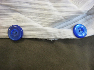
The next thing I needed to do was sew buttons and button holes on my shirt because otherwise the shirt would hang loosely on my model and wouldn't cover up a lot of their chest. The first thing I did was sew the buttons on to establish a position on the shirt that the button holes would match when I cut them. I chose these blue buttons because the colour fits within the colour scheme I have been building for this outfit I personally think they look visually appealing. I then cut the button holes on the opposite side and sew around the edges so it wouldn't rip further or fray the shirt. Overall I think I did a good job of selecting the buttons and applying them to the shirt because they feel very secure. I think I did a good job on the button holes as well as they fit over the buttons perfectly so far haven't frayed. However I would have liked to have to change the placement of the buttons because they shirt looks somewhat uneven when its buttoned up. 


 Here is the final outfit modelled by a friend who I felt suited the look of the outfit and posing like a typical model. Although the outfit on her looks a bit baggy on her I think the outfit overall has been very successful because it manages to capture all of he essences of my research subjects and then some thanks to my unique design decision. I managed to incorporate the smart thinking and military edge of WW2 clothing, the unique uses of material in upcycling, the complementary curves of Dior's fashion design, and finally the punk-ish flair of Mia Nesbit. What I like about the shirt is the unique asymmetrical collar that makes it stand out more then an average shirt or collar and the material itself is very nice. I like the skirt because it reminds me of Tudor dresses with their intricate patterns and their long drape like style (in this case they really are drapes). I like the hat because of it's military like design and the interesting texture of the pillow's material. If I was to give a criticism I would have made the dress custom-made for someone as my model hear complained that it was ill-fitting and slightly uncomfortable.


Fine Art - Finalising Comic

In today's session we attempted to finish our individual interpretations of our paintings and hopefully write up a self-evaluation using the self-reflective evaluation sheet. I finally finished the initial drawings of my comic and have now begun experimenting with the comic in the editing tool, Photoshop.


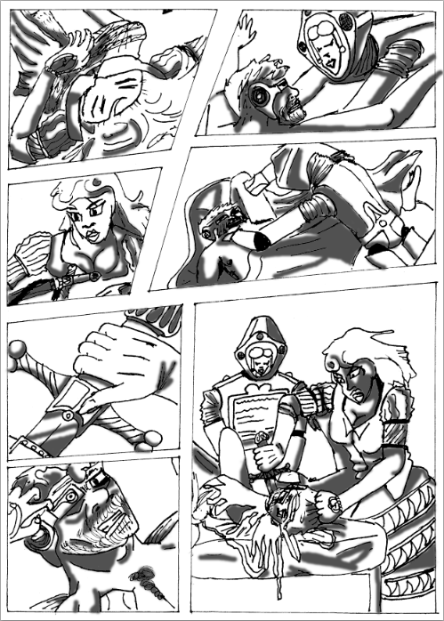
Here I have finished the sketched outlines and have put in the inks of the lines without the shadowing or any colouration. I had wish to actually draw up the final outlines in a more Sin City blockish shadow style but at the moment I don't have the time but I can try it in photoshop if I wish. I really like the poses and the composition that I used in this comic as it has quite a lot of action and movement and hwo it is broken up helps to add to intensity and brutal violence you see. However I do wish I had more time to expand my story and add some backgrounds but under the independing time limit I need to focus on whats important and whats only additional to the piece. If I have more time I would go back and work these aspects of the comic.


Here in this image I have finally added a bit of shadowing to the comic with the paint tool in a dark grey colour and have used gaussian blur on them a bit so the they seem to blend and dissipate into the other elements. I find the shadowing to be quite helpful in creating the dark atmosphere thats required for most cyberpunk productions and has added a bit more needed detail for the characters to become more three-dimensional and burst with the spark of life needed for the suspension of disbelief. However it is pretty shallow tonal work and needs to be incorporated better into the piece so my theories above hold some water and not become some self-righteous excuse on my it needs to be incorporated. Maybe I should add more detail into the shadows themselves to make the characters even more detailed and three-dimensional.


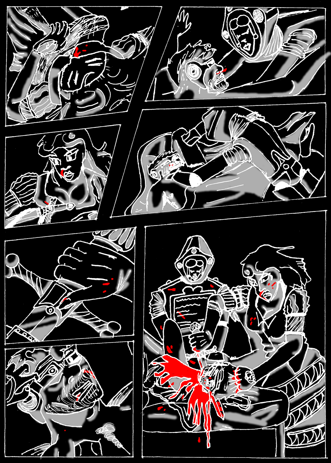
Here is the final conclusion of everything that I have done with the new added detail of blood splattered across the characters to enhance the violence that is contained within thsi piece. The use of bright red for the blood and the only colour that is represented within the piece was inspired by the original paintings use of significant colour to illustrate a point and the comic Sin City's use of symbolic colours that also helped in illustrating their points and meanings. What I really like about this use of red within the comic is how hard it hits the viewer, especially in the final panel where the beheading is taking place (the poses inspired by the original painting, of course) and huge splurt of blood is coming out of Holofernes neck. However I feel it would become even more effective if the outlines, shadows, and back ground was inverted because I think use of red on black helps to improve the vibrance and brightness of the colour even more then the stock white background.
Here I tried out my previous idea in another image to see if would have been more effective if it was on a inverted comic strip rather then a normal one. I was right i  the fact that the darkness of the black would contrast well with the brilliance and brightness of thye colour red but the rest of the comic suffers as it rooks rather bizzare inverted since the shadows are our now white and the supposed lighter parts of the subjects within the comic have now bgecome the darker elements. While it is effective I personally think that I should stay with the white background for the final piece because it looks to bizzare and somewhat ugly when it is inverted.
Here is the final image with a blue background to relate to the colour association of the real painting and to create a darker background to make the panels more distinctive from each other. I think it looks quite effective in it's execution thanks to the fact that it adds a new layer of colour to the comic without colouring it more and ruining the effect of the striking blood in the comic. I also how it creates contrast between the figures and the background rather like the original painting and making sure each figure drawn on the paper pops out individually instead of just blurring into the background like the original.


Wednesday, 4 February 2015

Vis Com 3: Leaflet 2

In today's session I created another leaflet in the style of the poster that I created last week. Here I took some information from my other leaflet and inserted it into this so I could spread my information and illustrations a bit more fairly then just including all of the information and all of my informations into one tiny leaflet. The design is based upon a lot of grunge and punk posters that are quite popular with marketing demographics when trying to communicate ideas to a more teenaged to young adult orientated crowd. the text was chosen of dafont.com for its decaying, messy look to suit the vibe of the leaflets. The the first leaflet has cool foldout gimmick in that on the front it features a enticing normal woman in a red hood, but on the the other page when folded out reveals the same woman except she is more terrifying and heavily demon-ised giving the viewer a bit of a surprise.


The second half of the leaflet was made in a unconventional way as it actually spreads itself over the other pages instead of separating itself into the usual three column structure that my other leaflet followed I decided not to alter my sketches to much in this leaflet as I felt it does need to look somewhat factual instead of just a grungy art piece. I kept the text the same to nail in the sort of realism that you'd expect from a NHS campaign leaflet but also added some light humour on the title and the cover of the leaflet to appeal to a more youthful audience. The backgrounds were complied from multiple textures of aged paper and photographs to create that distinct grungy effect that you find in most grunge pieces. The reason why I went with this white paint splash motif that backs up the text is because it allows me to put up any textual background without fear of if it being lost in its complexity


Saturday, 31 January 2015

Vis Com 3: Poster 2

In today's session I started to create my second poster which will end up in my final display, and based upon some more illustrations that I made in my book. The inspiration behind this sketch was a poster from the game BioShock Infinite on racial purity through restricted sex and some fairy-tale red riding hood imagery to create a illustration about safe sex with sufferers of Lycanthropy. I added canine teeth and long fingernails to remind the viewer of this fact. The reason why I based the pose on this image in particular was because I believe it reflects the dangers of mysterious women and casual sex, although in different ways, and the moon imagery in the original poster helped to make a connection. Red Riding hood imagery was included as it is mostly ingrained in collective consciences plus the association with wolf from that particular story.


The painting was completed in sections rather then in just one layer so I could customize each section of the figures colour, brightness, and contrast easily instead of having to repeatedly paint over sections of it. The tones of the painting was achieved by using a combination of the burn tool and the paint tool to create darker areas that could edit with the brightness and contrast to make it look more appropriate. I added a texture of tiles onto the hood to give it a woven cloth like feel to it and to differentiate the tones a little bit more. I had to experiment a lot with the saturation and the hue to create the most appealing yet darker look of the hood and the skin tone also took some perfecting because I never seemed to get the balance of colour right as she could look a little too red or a little too orange. I think overall though today has been a successful session in creating the initial illustration.


Wednesday, 28 January 2015

Vis Com 3: Finishing Poster

In today's session I finished off my second poster and have begun to document it in my book as well as consider the next steps I should take for the rest of the project time. I experimented  with texture and colour within this poster and the results were very interesting to say the least. To start off with I looked up dafont.com to look at some fonts that I would like to use in my poster when I spotted some grungy looking ones that gave me the idea to make this poster have a grunge style to reflect it's teenage audience. The phrase I create "Wolves never show their true hides" was based upon the fable the wolf in sheep's clothing in reference to the fact that you will never know who a werewolf is until it's too late. My slogan "Stay Safe, Stay Aware" made another appearance with the reminder to wear condoms. The text has a white paint like backdrop because of grungy visual to it.


I used a lot of old photo and paper textures within this piece to create the grungy aesthetic as well as a gradient overlay to create interesting colour patterns. There was old photo texture that covered the background and hood layers to make them stand out a bit more. There was another old photo texture overlay over all the images except for the logo, and a grungy black border that surrounds everything except for the logo. I think the textures create a interesting effect over the paint job as some areas are darkened but other areas of scratches and smudges are lighter making it slightly old looking but in a sort of cool hipster nostalgic way instead of like an actual old photograph way.  I like the background quite a bit as because of the high contrast and multiple textural and colour layers it only suggests it is an actual forest and makes the poster feel more surreal and, again, more grungy.