Thursday, 26 February 2015

FMP - Initial Ideas

In today's session I started to brainstorm my ideas for my final major project including the first stages of research that I wish to take for my main inspirations. I first started to think about the sort of things that I have become interested in lately and how I could translate that to a overall concept that could be explored for my final major project. Some of the things that I had become interested in lately was eastern culture, especially the Mesopotamian area of countries such as Turkey, Iraq, and to a extent India. So I started think of other things that I was also interested in and one thing came into mind recently was the sub-culture steampunk, which is a sort of aesthetic style based upon late 19th and early 20th century interpretations of what the future may look like with an influence coming heavily from the victorian era. This reminded me of the British empire and this is where I got my theme from which is empires as a general concept and what sort of subjects they bring up about when talking about them.


Here is where I drew my mind-map of all of the things that I would like to research about including the main areas I would like to focus on. theses included the British empire as its probably the one I know most about and because it allows me to explore the notions of steampunk along with my overall theme. I also want explore the Ottoman empire as they are rooted in Turkey which is one of the countries I would like to explore for aesthetic styles and they have such a long history that goes way back to the 1300's. The last empire I would like to look at  is the roman empire because of their classical architectural and sculpture design plus they brought about modern western civilization. What I hope to achieve by the end of this project is a original interpretation of the steampunk sub-culture while exploring the themes of empires in a creative way.


Thursday, 5 February 2015

Fashion - Final Session

In the final session of fashion we were required to finish up all of our pieces of clothing ready to be shown off as a outfit in a photo shoot with a real-life model. So the first thing I did today was create a hat for my outfit because I felt it would look incomplete without some sort of headgear to complete the display. I based the design off a combination of Dior's style of hats with a World War 2 soldier hat to relate back to my research I completed early on. I made the hat from the material I found off of pillow case which had a unique pleated look and had a green army because colour so it suited the theme I was going for. I really like because how the hat looks because it both looks fashionable with a touch of military design. Although it  doesn't fit over every head so it limits my model options.


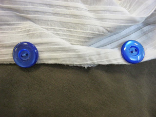
The next thing I needed to do was sew buttons and button holes on my shirt because otherwise the shirt would hang loosely on my model and wouldn't cover up a lot of their chest. The first thing I did was sew the buttons on to establish a position on the shirt that the button holes would match when I cut them. I chose these blue buttons because the colour fits within the colour scheme I have been building for this outfit I personally think they look visually appealing. I then cut the button holes on the opposite side and sew around the edges so it wouldn't rip further or fray the shirt. Overall I think I did a good job of selecting the buttons and applying them to the shirt because they feel very secure. I think I did a good job on the button holes as well as they fit over the buttons perfectly so far haven't frayed. However I would have liked to have to change the placement of the buttons because they shirt looks somewhat uneven when its buttoned up. 


 Here is the final outfit modelled by a friend who I felt suited the look of the outfit and posing like a typical model. Although the outfit on her looks a bit baggy on her I think the outfit overall has been very successful because it manages to capture all of he essences of my research subjects and then some thanks to my unique design decision. I managed to incorporate the smart thinking and military edge of WW2 clothing, the unique uses of material in upcycling, the complementary curves of Dior's fashion design, and finally the punk-ish flair of Mia Nesbit. What I like about the shirt is the unique asymmetrical collar that makes it stand out more then an average shirt or collar and the material itself is very nice. I like the skirt because it reminds me of Tudor dresses with their intricate patterns and their long drape like style (in this case they really are drapes). I like the hat because of it's military like design and the interesting texture of the pillow's material. If I was to give a criticism I would have made the dress custom-made for someone as my model hear complained that it was ill-fitting and slightly uncomfortable.


Fine Art - Finalising Comic

In today's session we attempted to finish our individual interpretations of our paintings and hopefully write up a self-evaluation using the self-reflective evaluation sheet. I finally finished the initial drawings of my comic and have now begun experimenting with the comic in the editing tool, Photoshop.


Here I have finished the sketched outlines and have put in the inks of the lines without the shadowing or any colouration. I had wish to actually draw up the final outlines in a more Sin City blockish shadow style but at the moment I don't have the time but I can try it in photoshop if I wish. I really like the poses and the composition that I used in this comic as it has quite a lot of action and movement and hwo it is broken up helps to add to intensity and brutal violence you see. However I do wish I had more time to expand my story and add some backgrounds but under the independing time limit I need to focus on whats important and whats only additional to the piece. If I have more time I would go back and work these aspects of the comic.
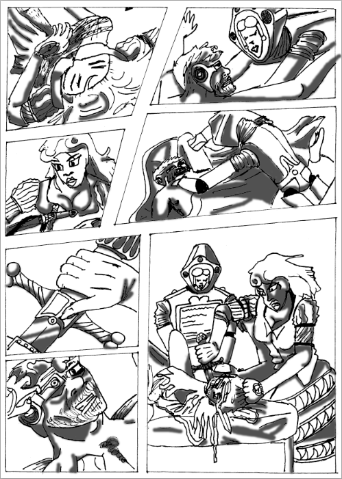

Here in this image I have finally added a bit of shadowing to the comic with the paint tool in a dark grey colour and have used gaussian blur on them a bit so the they seem to blend and dissipate into the other elements. I find the shadowing to be quite helpful in creating the dark atmosphere thats required for most cyberpunk productions and has added a bit more needed detail for the characters to become more three-dimensional and burst with the spark of life needed for the suspension of disbelief. However it is pretty shallow tonal work and needs to be incorporated better into the piece so my theories above hold some water and not become some self-righteous excuse on my it needs to be incorporated. Maybe I should add more detail into the shadows themselves to make the characters even more detailed and three-dimensional.


Here is the final conclusion of everything that I have done with the new added detail of blood splattered across the characters to enhance the violence that is contained within thsi piece. The use of bright red for the blood and the only colour that is represented within the piece was inspired by the original paintings use of significant colour to illustrate a point and the comic Sin City's use of symbolic colours that also helped in illustrating their points and meanings. What I really like about this use of red within the comic is how hard it hits the viewer, especially in the final panel where the beheading is taking place (the poses inspired by the original painting, of course) and huge splurt of blood is coming out of Holofernes neck. However I feel it would become even more effective if the outlines, shadows, and back ground was inverted because I think use of red on black helps to improve the vibrance and brightness of the colour even more then the stock white background.
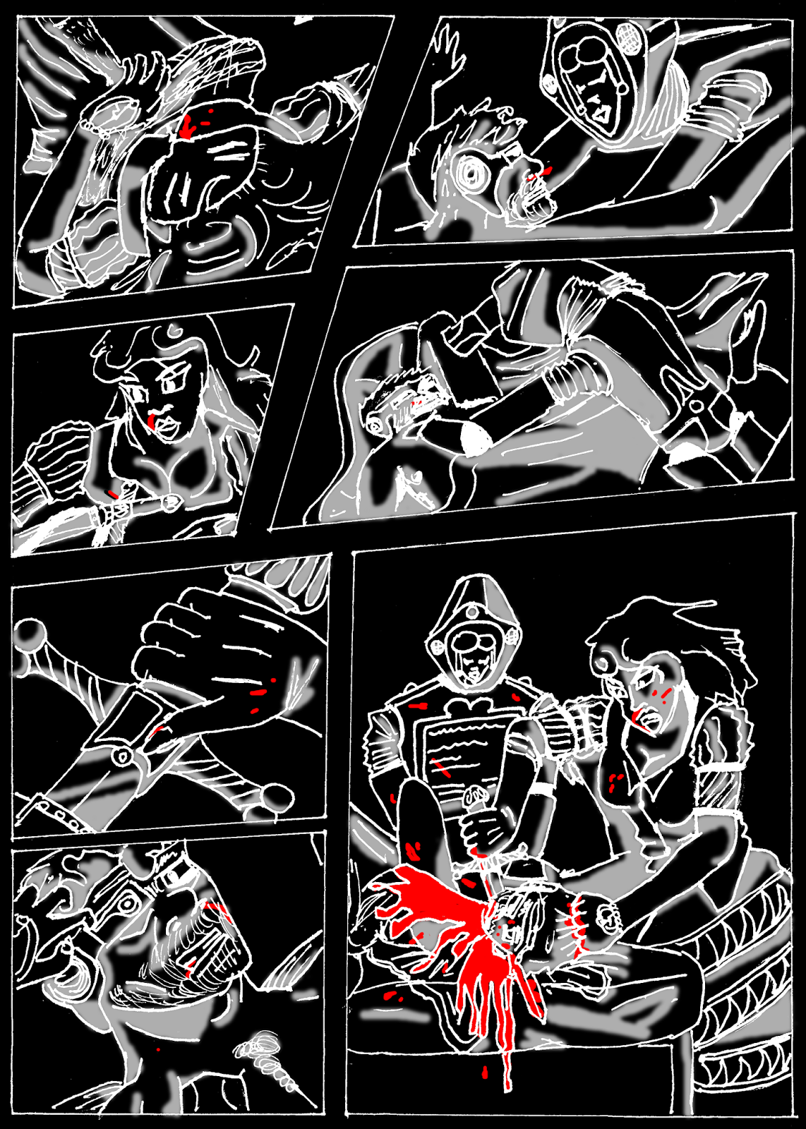
Here I tried out my previous idea in another image to see if would have been more effective if it was on a inverted comic strip rather then a normal one. I was right i  the fact that the darkness of the black would contrast well with the brilliance and brightness of thye colour red but the rest of the comic suffers as it rooks rather bizzare inverted since the shadows are our now white and the supposed lighter parts of the subjects within the comic have now bgecome the darker elements. While it is effective I personally think that I should stay with the white background for the final piece because it looks to bizzare and somewhat ugly when it is inverted.
Here is the final image with a blue background to relate to the colour association of the real painting and to create a darker background to make the panels more distinctive from each other. I think it looks quite effective in it's execution thanks to the fact that it adds a new layer of colour to the comic without colouring it more and ruining the effect of the striking blood in the comic. I also how it creates contrast between the figures and the background rather like the original painting and making sure each figure drawn on the paper pops out individually instead of just blurring into the background like the original.

Wednesday, 4 February 2015

Vis Com 3: Leaflet 2

In today's session I created another leaflet in the style of the poster that I created last week. Here I took some information from my other leaflet and inserted it into this so I could spread my information and illustrations a bit more fairly then just including all of the information and all of my informations into one tiny leaflet. The design is based upon a lot of grunge and punk posters that are quite popular with marketing demographics when trying to communicate ideas to a more teenaged to young adult orientated crowd. the text was chosen of dafont.com for its decaying, messy look to suit the vibe of the leaflets. The the first leaflet has cool foldout gimmick in that on the front it features a enticing normal woman in a red hood, but on the the other page when folded out reveals the same woman except she is more terrifying and heavily demon-ised giving the viewer a bit of a surprise.


The second half of the leaflet was made in a unconventional way as it actually spreads itself over the other pages instead of separating itself into the usual three column structure that my other leaflet followed I decided not to alter my sketches to much in this leaflet as I felt it does need to look somewhat factual instead of just a grungy art piece. I kept the text the same to nail in the sort of realism that you'd expect from a NHS campaign leaflet but also added some light humour on the title and the cover of the leaflet to appeal to a more youthful audience. The backgrounds were complied from multiple textures of aged paper and photographs to create that distinct grungy effect that you find in most grunge pieces. The reason why I went with this white paint splash motif that backs up the text is because it allows me to put up any textual background without fear of if it being lost in its complexity